UserWiki:Apx/designshiz
Jump to navigation
Jump to search
Open issues
Pending


josi: The semantics gallery doesnt work on the mobile frontend. I'm not sure if this can be fixed without directly adding code to both the mobile front end and the semantics extention tho. if the featured content was above the left column on mobile browsing it wouldn't really be much of an issue anyway as it would be mostly hidden

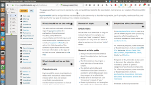
josie: Summaries look weird on mobile front end, they are aligning correctly but they turn into autocollapsed strange thingys. A way to deal with this might be to keep the autocollapse but make it fit in with the panel aesthetic OR we could change the titles of the individual panels so that they are not formatted as wiki subsections with ='s on either side but instead slightly enlarged text which looks identical. This would be the better option


Oskykins: If I click on the name of a new user who has not made a social profile, I get redirected to edit their page instead of being able to comment on their profile etc.

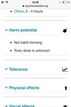
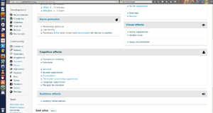
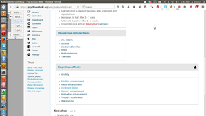
Oskykins: Cognitive and auditory boxes align weird on Zolpidem/Summary when I am zoomed in at 133% instead of being next to each other. This also happens on the depressant article.

Oskykins: There are alignment problems on Armodafinil/Summary when not zoomed in as well.

Oskykins: The icons on the guidelines page look weird on my netbook (not zoomed in at all)
In-Progress
TBD

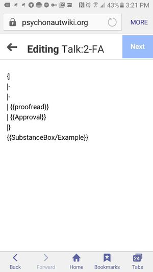
Oskykins: Cannot fully edit Talk:2-FA on phone.
Rejected

josi: the image icon/logos on the submission panels are no longer left aligning with the text (as seen in 3 pics ago) but are instead above them. apx: Your cache is not invalidated. On the iPhone 4, it looks like this: http://data.sly.mn/1J422X3L0G2r. It was a conscious design decision, because it is impossible to fit the text box for mobile when the icons are on the left.
Fixed

josi: The "Version 1.0" splits into two lines and looks buggy, it should probably just bump to a new line. The text in the social profile doesnt wrap and instead hangs off the panel and goes off the screen. the avatar gets really small also. oh and the text in the titles of the panels is a serif font on mobile when it should be a serif font the same as the desktop version


Oskykins: On the recent changes page, the > arrow drop down menu does not open up on mobiles. apx: fixed by backporting the extension "clean changes" into the mobile javascript assets.

Oskykins: The recent changes page does not wrap text, causing users to scroll to the right. apx: fixed by making tbody a flexbox, the first child 'td' using flex:1 and the second child 'td' using flex:2, having a 1:2 space sharing.

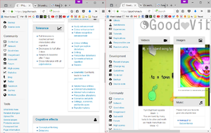
josie: although the autoalign is technically working I think it should kick in at a wider pixel width than it currently is. Maybe 350px? It might depend on the page though. For example it should align at the width of the youtube video on the goodvibes page and align at width of the gallery on the mainpage so they avoid overhang. Also it seems that different columns align at different widths on the summaries. Lots of currently aligns far too late on a lot of the new autoaligned pages which can result in the panels looking weird unless its window is super thin. Mobiles are already thin enough but I think this would improve desktop browsing too. Thank you apx I hope this makes sense<3

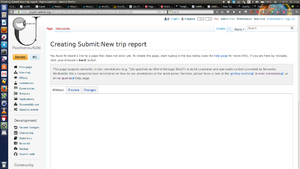
Oskykins: When creating a new page using the submission panel on the experience index, the title shows up as "Submit:" instead of "Experience:".
other issues
- Fix submission panel page prefix
- Fix font for alert-boxes (retrofit previous styles)
pages with panels which are not autoaligned
Tutorial indexExperience_index- Replication index <-- this is a really hard one. Need to figure out how to update 1) the alert boxes and 2) fix the Template:Effects/Gallery page
Template:Responsible_use2Responsible drug useTemplate:SummaryGuidelinesTo-do listDonateNetworkGood vibesPsychedelicDissociativeDeliriantStimulantDepressantBenzodiazepineOpioid
Personal notes
- Gallery code must be touched to make it responsive
- introduce service workers for caching
- > fix warning box over articles